Among the more famous versions of Hunchback, each version has a lot of movie posters. For this post, we’re going to look at the top seven best Hunchback movie posters. These are not in a specific order and they are all available on Amazon.
#1 All the characters, the Disney version
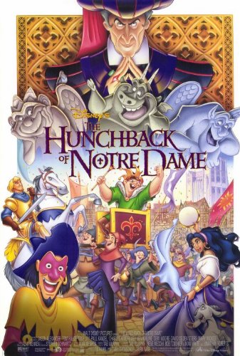
Disney Hunchback of Notre Dame Poster
This poster has a lot of energy. You get a sense of the personality of all the characters. I like how Clopin and is front and center and I like how Frollo looms over everyone from on high. I don’t really like how central the gargoyles are but that is a nitpick.
2# All the characters Chaney version
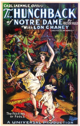
1923 Hunchback of Notre Dame Poster
I really like how front and center Esmeralda is in this poster. All the other character are pretty much there in the crowd and their personality come through. I also like the color palette on this one which is ironic seen this was a tinted movie.
#3 Pseudo-Monster Movie, 1939 Version
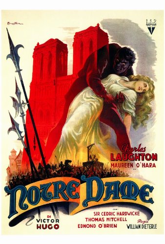
1939 Hunchback of Notre Dame Poster
I debated whether or not to included this one since it kind of plays with the audience’s expectation of a monster and Laughton is one of the least monstrous hunchbacks but that’s its strength. It has the signifier that says it’s a hunchback movie but makes it feel different and I like that it hides Quasimodo‘ looks. I also like the red tone
There is a similar 1939 poster with a Quasimodo in silhouette against Notre Dame and pillory but it just not a dynamic.
#4 Stark Simplicity, 1923 Version

1923 Hunchback of Notre Dame Poster
This one made simple but it captures the imagination of what this movie could be like. And I find the design bold and graphic.
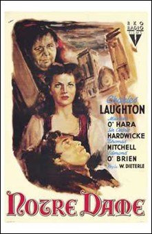
1939 Hunchback of Notre Dame Poster
I like this one as I really like the rendering of Maureen O’Hara. It just has a good composition to it though I can’t really tell if that is Jehan or Gringoire but I would it’s Jehan.
#6 Captivatingly Overprice, 1956 Version
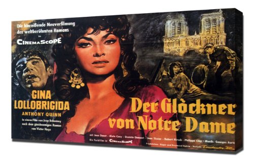
1956 Hunchback of Notre Dame Poster
I really like the picture vignettes in this and Gina Lollobridga looks lovely in this. Somehow this poster just makes the movie seem more like an epic.
#7 Pillory Scene, 1923 Version

1923 Hunchback of Notre Dame Poster
I debated between this one and another 1939 poster. I went with this one because I really like the way Esmeralda is depicted. It is also interesting to showcase the pillory scene in a movie poster.
Follow thehunchblog